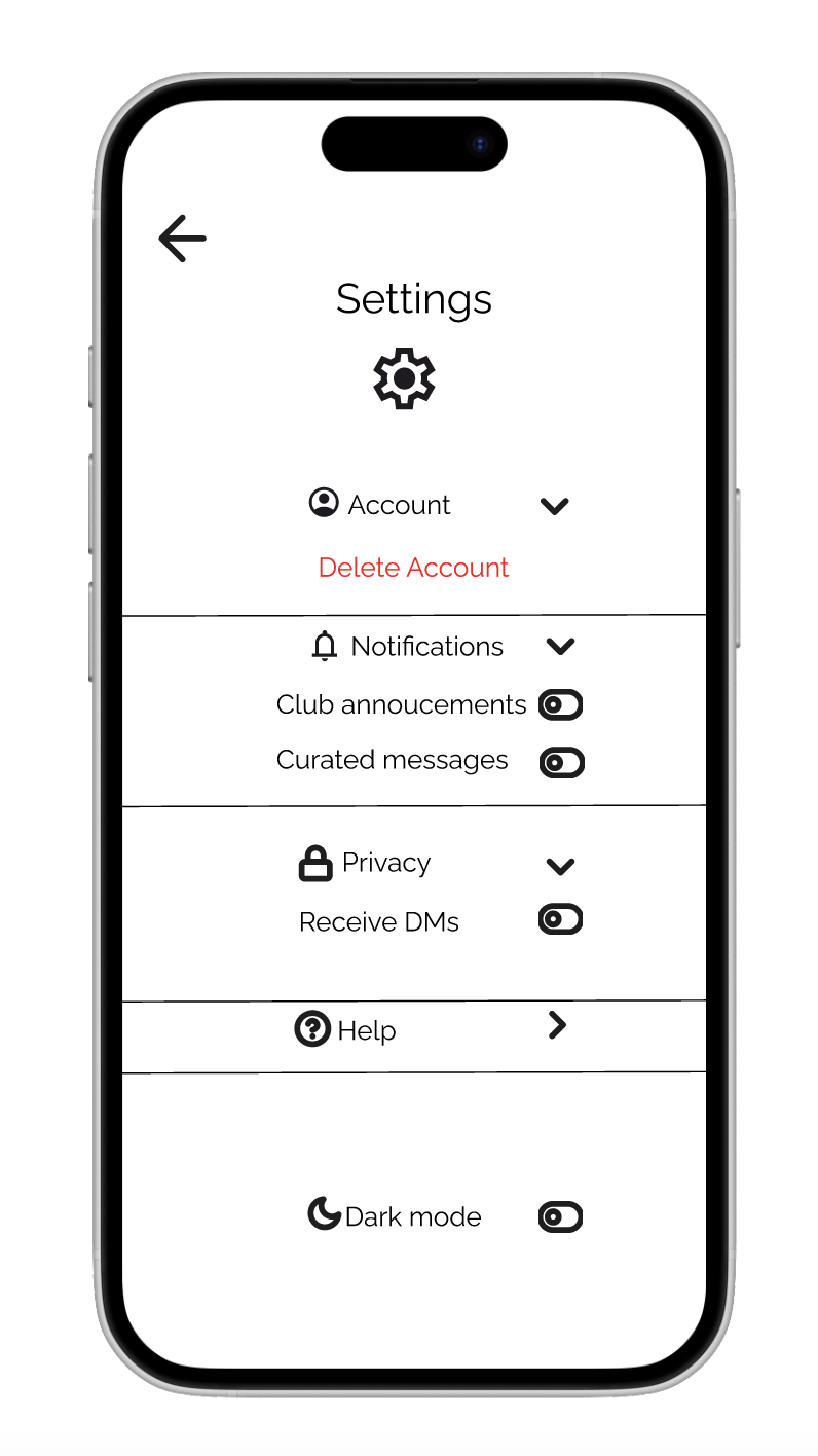
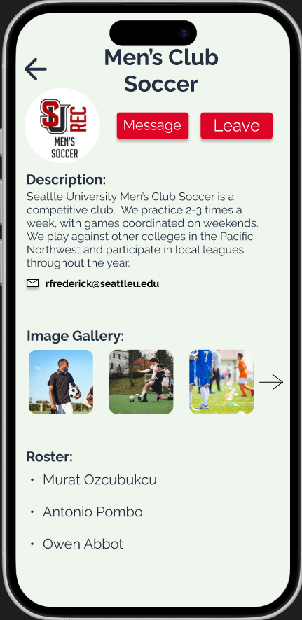
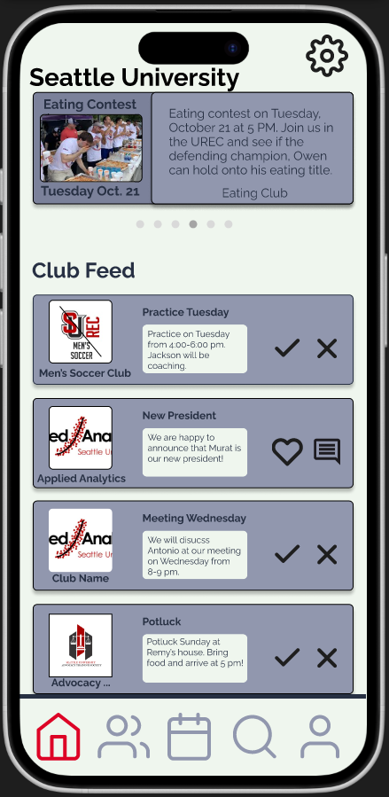
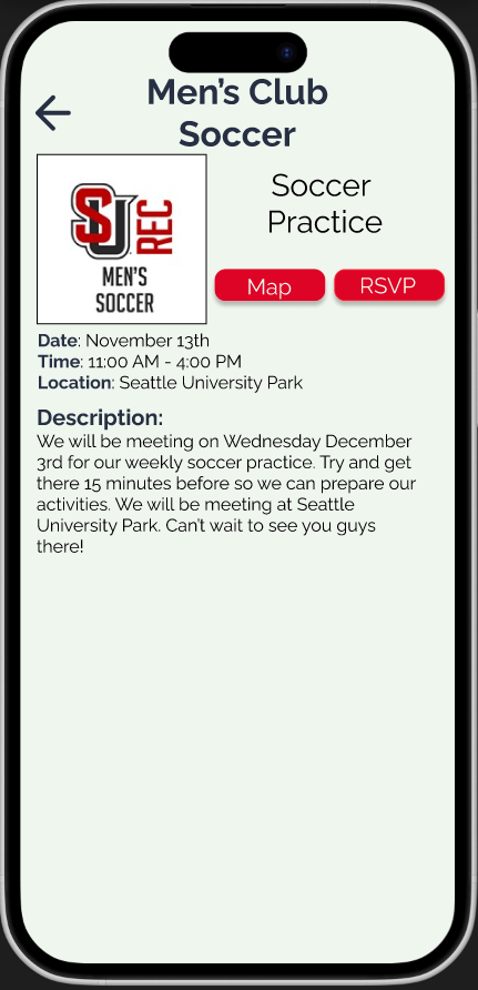
High-Fidelity Prototype
Bringing the interface to life in Figma.
What This Is
A polished, clickable Figma prototype of Campus Compass with:
- Finalized color palette and typography,
- Icons and visual hierarchy,
- Interactive flows for key tasks:
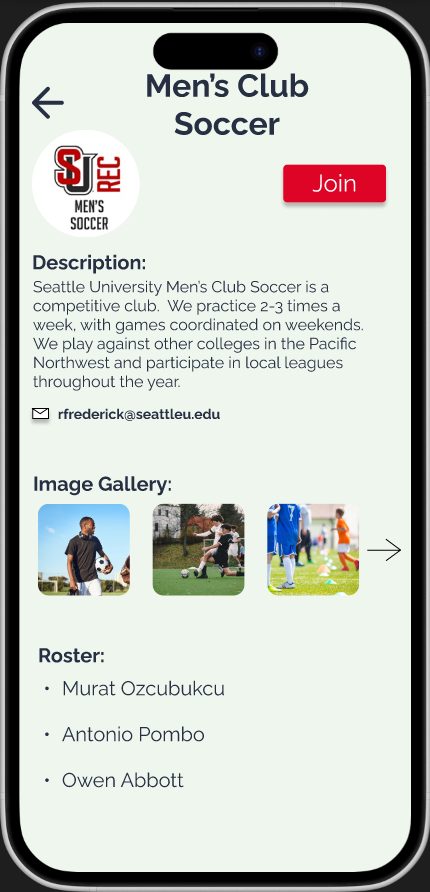
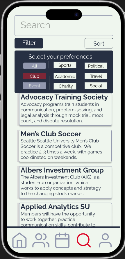
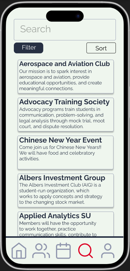
- Finding and joining a club,
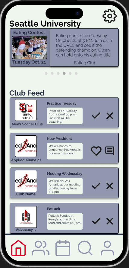
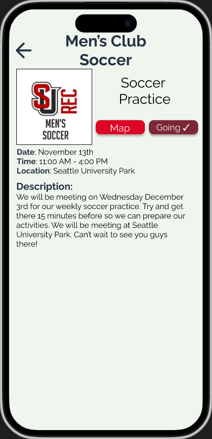
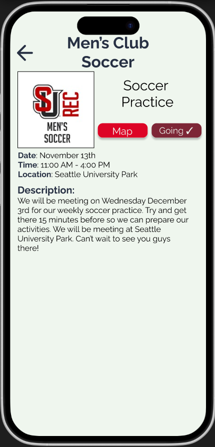
- RSVP'ing to events,
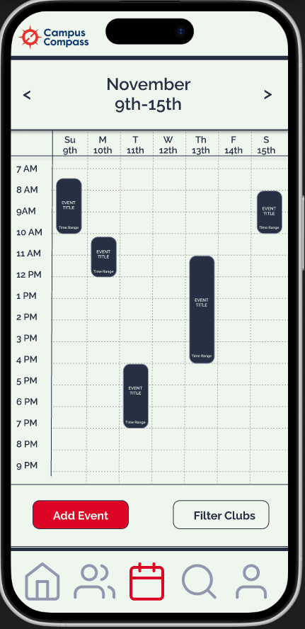
- Viewing the calendar,
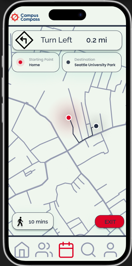
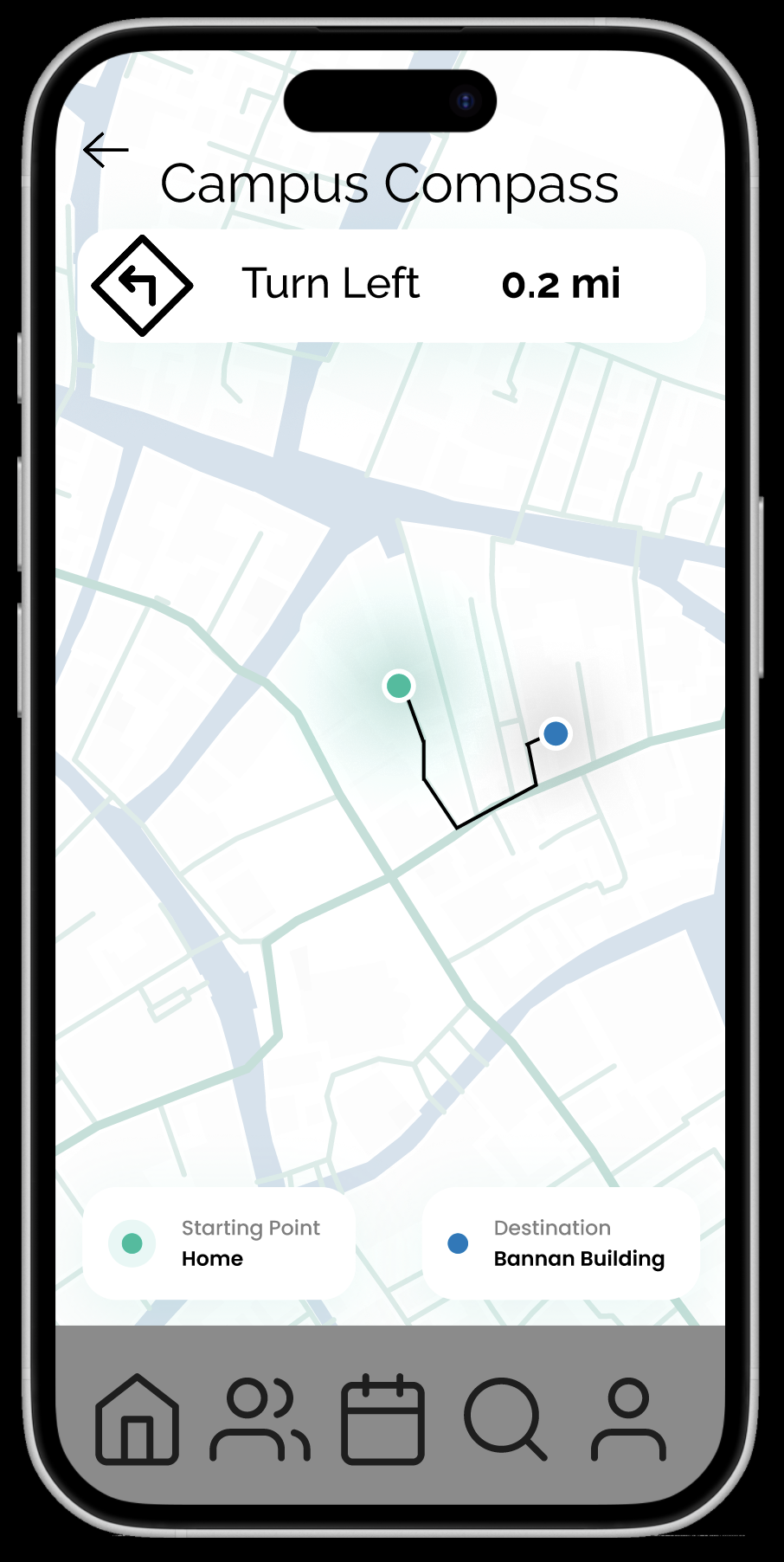
- Getting directions,
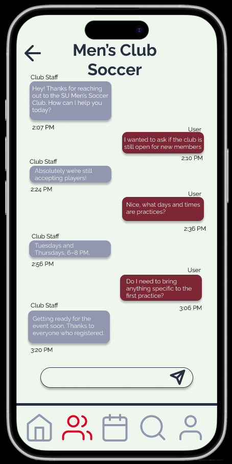
- Messaging club organizers.
Why We Created It
The hi-fi prototype closely simulates the finished product. It:
- Communicates the look and feel of the app,
- Allows for more realistic usability testing,
- Makes it easier to hand off to developers.
How It Connects in the Process
The hi-fi prototype builds directly on our wireframes. It keeps the same structure but adds:
- Colors and branding,
- Iconography,
- Visual states for feedback (e.g., RSVP vs Going).
What We Changed or Learned
Key decisions from low-fi to hi-fi included:
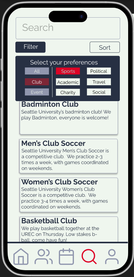
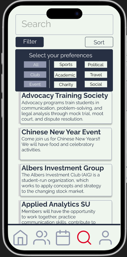
- Expanding the filter functionality on the search page with clearer categories and spacing,
- Changing the message button on club pages to a more recognizable icon,
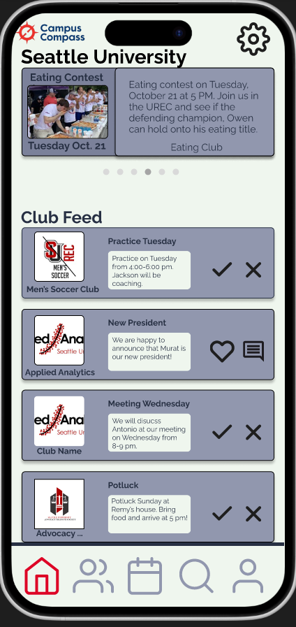
- Adding the app logo to important pages,
- Updating the bottom nav to highlight the current page,
- Adding consistent color treatment across all screens.
Hi-Fi Prototype